Find files, editable templates and browser test targets by what you need to make or test. The directory below is cut by format; the two collections under it cut the same library by subject and by workflow.
Four precomposed accented letters built the way real fonts build them, as composite glyphs referencing a base letter and a combining mark with a translation. For testing component resolution, nested-glyph handling, and subsetters that must keep a component's base glyph alive. Original typeface, free to use.
Contextual alternate substitution that fires on doubled letters: the second letter of aa, ee, oo, nn, ss and tt is replaced by an alternate carrying a visible baseline underscore, so a shaping result can be read straight off the page instead of out of a debug log. calt is on by default, which makes it a good test of whether a renderer applies default features at all. Original typeface, free to use.
The clean control for the checksum pair: a small, valid font whose head.checkSumAdjustment and every table-directory checksum are correct. Diff it against its damaged twin to see exactly which four bytes a validator is complaining about. Original typeface, free to use.
The same four accented letters flattened into simple glyphs with the mark contours copied in. Rendering is identical to the composite twin; the file size, the subsetting behaviour and the hinting story are not. Original typeface, free to use.
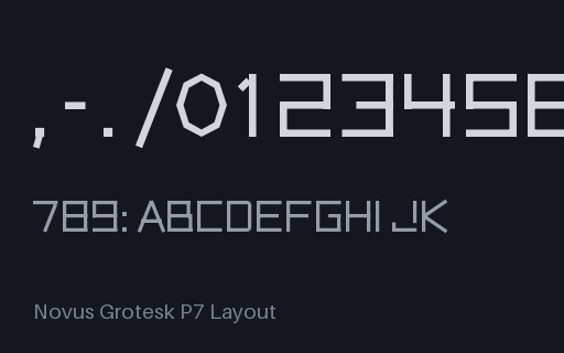
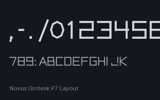
Every feature this family defines in one face: ligatures, kerning, contextual alternates, small caps, three stylistic sets, four figure features, fractions, mark attachment, aalt and locl. The single font to point a feature-discovery UI at. Original typeface, free to use.
All four figure features over one digit set: the default is proportional lining, tnum flattens every digit to 620 units for column alignment, pnum restores the proportional widths, and onum drops five digits below the baseline and raises two above the x-height. The measurable case for testing font-variant-numeric. Original typeface, free to use.
A real frac implementation as a chaining contextual substitution: the slash becomes a fraction slash, the digit before it becomes a numerator and the digit after becomes a denominator, with numr and dnom also reachable on their own. Coverage is deliberately limited to single-digit fractions, which is stated in the specs so a test can assert the boundary. Original typeface, free to use.
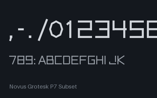
The complete face the rest of the subset set is cut from: the whole glyph repertoire with ligatures, kerning, contextual alternates, small caps, stylistic sets, figures, fractions, marks and localised forms intact. Measure it, then measure the cuts. Original typeface, free to use.
Standard and discretionary ligature substitutions in a real GSUB table: four liga ligatures including the three-glyph ffi, and two dlig ligatures that must stay off unless asked for. Each ligature's advance is the sum of its parts minus a documented tuck, so a shaping result is checkable by measuring. Original typeface, free to use.
The control for the all-features font: the same glyph set and the same metrics with no layout tables at all, so the alternates exist in the font but nothing can reach them. Any difference you measure against the full twin is the layout tables and nothing else. Original typeface, free to use.
Eighteen kerning pairs published as a GPOS pair-positioning lookup, with no legacy kern table present. Pair it with its kern-table twin to find out which table your layout engine is actually reading. Original typeface, free to use.
The same eighteen kerning pairs, this time in a format-0 legacy kern table with no GPOS at all. Modern shapers ignore kern when GPOS exists and some ignore it entirely, so this twin is how you tell which code path produced a given measurement. Original typeface, free to use.
Language-specific substitution through locl: tagging text as Turkish swaps the i, tagging it as Romanian swaps the S, and untagged text gets neither. The fixture for finding out whether your pipeline propagates a language tag from the document all the way to the shaper. Original typeface, free to use.
Mark-to-base and mark-to-mark positioning with a real GDEF glyph-class definition: three zero-width combining accents attach to ten base letters at documented anchors, and stacking a second mark uses the mkmk anchor. For testing diacritic placement without needing a full Unicode face. Original typeface, free to use.
An icon font with six simple pictographs (star, heart, check, arrow, circle, square) mapped to the Private Use Area (U+E000–U+E005), with the glyph map documented in the spec. A fixture for testing icon-font loading, @font-face, and PUA handling.
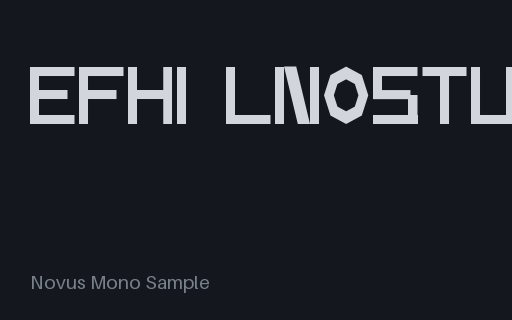
A fixed-width (monospace) demonstration typeface where every glyph shares the same advance width: a fixture for testing monospace detection, code-editor rendering, and column alignment. Original and free to use.
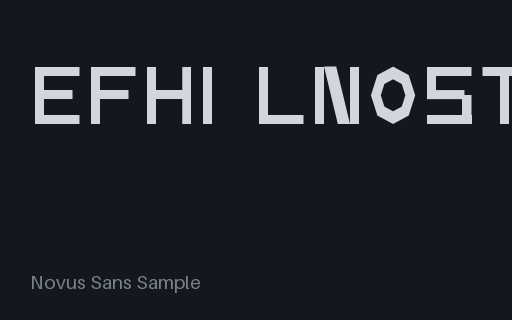
The Novus Sans Sample demonstration typeface as TrueType (glyf outlines): one member of a TTF/OTF/WOFF/WOFF2 conversion set built from scratch with fontTools. Original and free to use; a fixture for testing font loading, subsetting, and conversion.
This whole family is drawn as overlapping strokes rather than merged outlines, and this cut sets the two flags that tell a rasteriser so: OVERLAP_SIMPLE on simple glyphs and OVERLAP_COMPOUND on composites. For testing rasterisers that need the hint to avoid seams, and tools that must preserve the flags through a round trip. Original typeface, free to use.
The two-axis font with its width axis pinned to Condensed and its weight axis left live: the shipping shape for a site that wants one width but the whole weight range. For testing that a loader reads the reduced fvar rather than the original axis list. Original typeface, free to use.
Byte-for-byte the same conflicting metrics as the disagree fixture, with one bit changed: fsSelection bit 7, USE_TYPO_METRICS. A conforming renderer must now prefer the OS/2 typo family and produce a 1.0 em line box. One bit, a 40 percent difference in leading. Original typeface, free to use.
A full 26-glyph small-capital set reachable through smcp from lowercase and c2sc from capitals. Because the lowercase of this face is unicase, the small caps sit at a third, measurable height: 560 design units against 500 for lowercase and 700 for capitals, so a failed substitution shows up as a height rather than as a subtle shape difference. Original typeface, free to use.
A real static instance cut from the wght variable font at 900. Outlines interpolated once and baked, fvar and gvar stripped, usWeightClass set to match. For testing static-versus-variable fallback paths and family/style grouping. Original typeface, free to use.