Find files, editable templates and browser test targets by what you need to make or test. The directory below is cut by format; the two collections under it cut the same library by subject and by workflow.
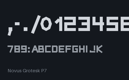
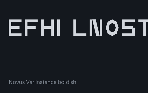
A real static instance cut from the wght variable font at 700. Outlines interpolated once and baked, fvar and gvar stripped, usWeightClass set to match. For testing static-versus-variable fallback paths and family/style grouping. Original typeface, free to use.
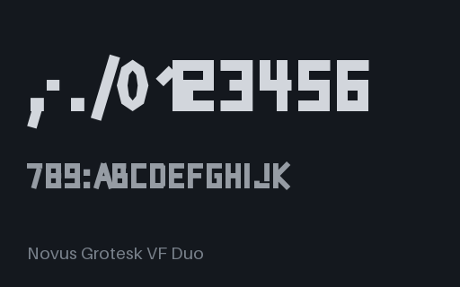
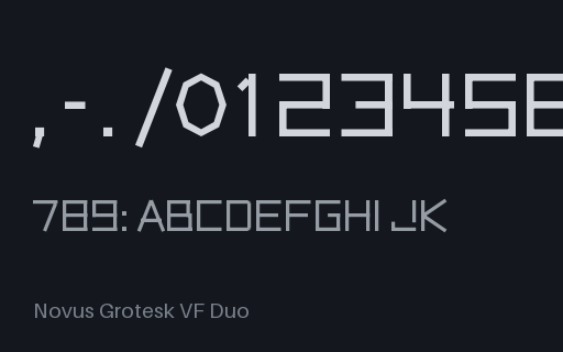
A two-axis instance baked out of the weight-by-width variable font, with both usWeightClass and usWidthClass set to match. For testing that a family grouper reads width from OS/2 rather than guessing it from the style name. Original typeface, free to use.
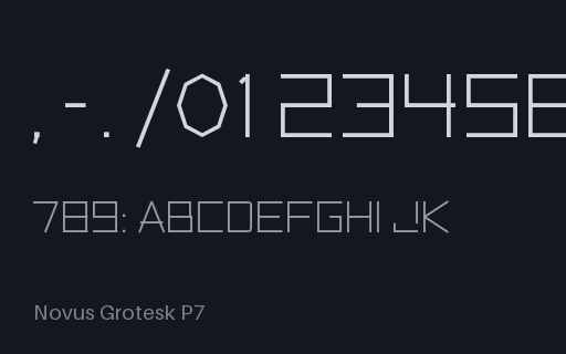
A real static instance cut from the wght variable font at 300. Outlines interpolated once and baked, fvar and gvar stripped, usWeightClass set to match. For testing static-versus-variable fallback paths and family/style grouping. Original typeface, free to use.
A real static instance cut from the wght variable font at 500. Outlines interpolated once and baked, fvar and gvar stripped, usWeightClass set to match. For testing static-versus-variable fallback paths and family/style grouping. Original typeface, free to use.
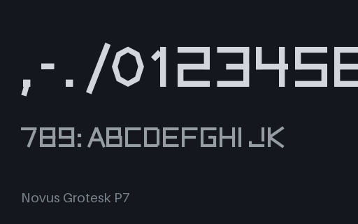
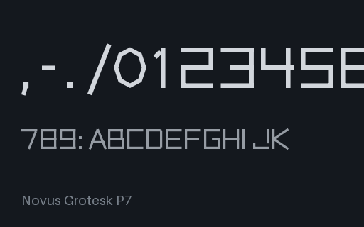
A real static instance cut from the wght variable font at 400. Outlines interpolated once and baked, fvar and gvar stripped, usWeightClass set to match. For testing static-versus-variable fallback paths and family/style grouping. Original typeface, free to use.
Three stylistic sets, each with a human-readable name published through FeatureParams in the name table: the metadata a font menu needs to show 'Squared G and R' instead of 'ss01'. For testing feature-name discovery as much as the substitution itself. Original typeface, free to use.
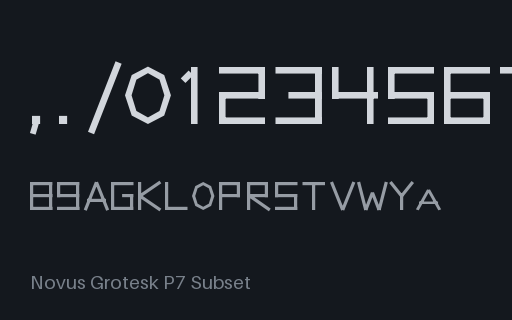
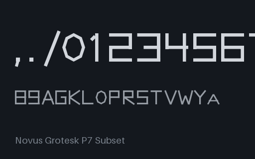
The same probe-character subset with every OpenType feature stripped: what many web-font pipelines produce by default. GSUB and GPOS survive as empty shells, so a tool that merely checks whether the tables exist reports the font as fully featured while nothing ligates, kerns, or turns into small caps. Original typeface, free to use.
A subset cut to just the characters the kerning, ligature, small-cap and figure probes need, keeping every OpenType layout feature whose glyphs survived. Half of a pair whose only difference is the layout tables: the pair that shows what a default subsetter setting silently costs you. Original typeface, free to use.
One design in TrueType outlines: quadratic contours in a glyf table with a loca index. Its CFF twin carries the same design in cubic charstrings, so converting one and diffing against the other tests an outline converter rather than a whole font pipeline. Original typeface, free to use.
The same design on a 1000-unit em square: the decimal grid PostScript and most web fonts use. Diff it against its twin at the other unitsPerEm to catch code that hardcodes 1000 or 2048 instead of reading head.unitsPerEm, and to see where rounding shows up. Original typeface, free to use.
The same design squeezed onto a 128-unit em, the coarse end of what the specification allows. Coordinates quantise hard, so this is the fixture for testing scaling maths, rounding, and any code that assumes a font has enough resolution to hint. Original typeface, free to use.
The same design on a 2048-unit em square: the power-of-two grid classic TrueType fonts use. Diff it against its twin at the other unitsPerEm to catch code that hardcodes 1000 or 2048 instead of reading head.unitsPerEm, and to see where rounding shows up. Original typeface, free to use.
usWinAscent and usWinDescent are deliberately set below the real glyph bounding box, which is the classic cause of clipped accents and cut-off descenders on Windows. The head table still reports the true extents, so a validator can catch the contradiction and a renderer can be measured against it. Original typeface, free to use.
A variable font that is intentionally incomplete: the STAT table OpenType requires of every variable font has been removed, while fvar, gvar and the named instances remain. It still renders, which is exactly the problem: style linking, family grouping and instance naming quietly degrade instead of failing loudly.
A variable font carrying one registered axis and one custom axis. Custom tags are all-uppercase by specification and must be looked up by name rather than assumed, so this is the fixture for a UI that hardcodes wght/wdth/slnt/opsz and silently drops everything else. Original typeface, free to use.
The same three masters as the plain wght variable font, plus an avar table that warps the axis so most of the weight change happens in the first third of the slider. Diff it against its no-avar twin: identical outlines, different rendering at every intermediate value. Original typeface, free to use.
The control half of the avar pair: identical masters and identical gvar deltas, with no avar table, so the axis maps linearly. Any rendering difference against its avar twin is the avar table and nothing else. Original typeface, free to use.
All four registered axes in one face (weight, width, slant and optical size) from eight axis-extreme masters. The font a variation UI should be tested against before it meets a real four-axis release. Original typeface, free to use.
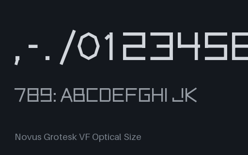
A single-axis variable font on the registered opsz axis, built from 3 interpolating masters so the deltas are real: stems thicken and tracking opens at small optical sizes and reverse at display sizes. Named instances and a STAT table are included. Original typeface, free to use.
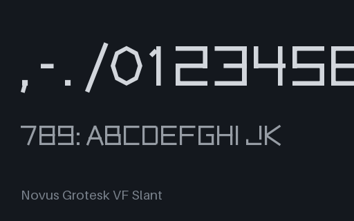
A single-axis variable font on the registered slnt axis, built from 2 interpolating masters so the deltas are real: the whole face shears forward as slnt goes negative, with the axis maximum equal to the default. Named instances and a STAT table are included. Original typeface, free to use.
A single-axis variable font on the registered wdth axis, built from 3 interpolating masters so the deltas are real: advance widths and glyph boxes narrow and widen with the axis. Named instances and a STAT table are included. Original typeface, free to use.
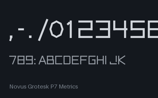
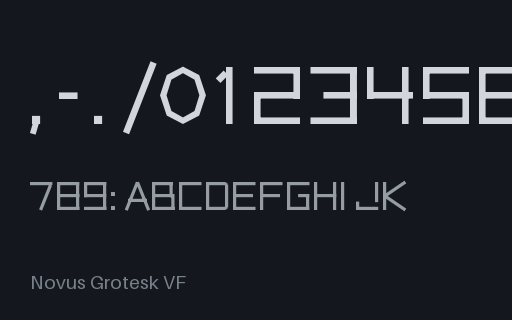
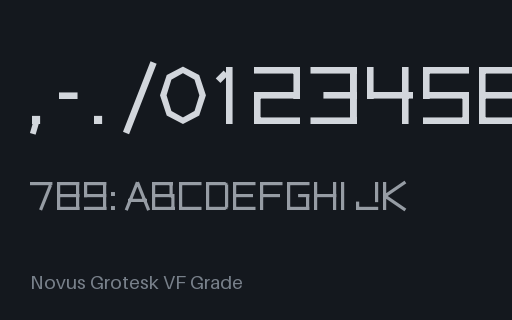
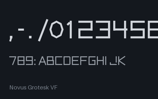
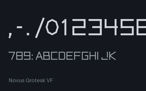
A true variable font: three interpolating masters compiled through fontTools varLib, so the wght axis carries real gvar and HVAR deltas rather than an fvar record over static outlines. Five named instances and a STAT table with a Regular-to-Bold linked value. Original typeface, free to use.
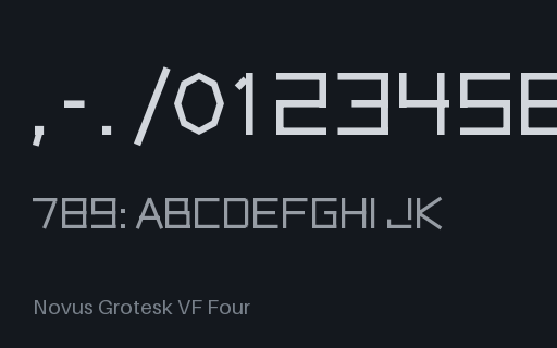
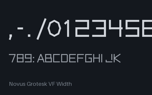
A two-axis variable font (weight by width) built from seven masters, with all nine named instances from Condensed Regular to Expanded Black and a two-axis STAT table. For testing instance pickers, axis sliders, and CSS font-variation-settings with more than one axis in play. Original typeface, free to use.